
Thursday, June 30, 2011
Entering SeekingAlpha's Top 50
Currently I'm ranked the 50th instablogger on SeekingAlpha. Just dumped a screenshot so I can brag about it later. My pen name on SeekingAlpha is Diffusion.

Cautious Is Healthy
A piece on Barron's today listed a couple of cautious signs:
- Possible end-of-quarter window dressing
- Cautious comments from prestige investors
- Anemic trading volume
- Investors park money in money market
We just passed an exhaustion bottom - It's a round shape on the chart. Market sentiment is at inflection point. It is understandable to be cautious. This explains the low volume. Plus there is a major holiday next week. A couple of fear factors, such as TED spread and Libor OIS spread are all in the comfort zone, indicating the credit market is still stable.
Wednesday, June 29, 2011
Big Money Index an Lagging Indicator From Now On?
Lately the Big Money Index behaved more like a lagging indicator. Around late May there was a negative divergence between BMI and S&P 500, but S&P 500 didn't follow BMI to move higher. Instead, BMI followed S&P 500 and move lower. Now there is a negative divergence under development. However it appears that this time S&P 500 will lead again.


BMI was designed to indicate the money flow into or out from the market. And it has been a leading indicator for two years. The recent change could signify that we are now in a different phase of the bull market.
In the past two years when BMI was leading, investors have correctly anticipated the trajectory of the market. But from now on, investors' predictive power is likely diminished, and they may just follow the market up and down. Indeed, in the past two years, the macro economic trend is determined by fiscal and monetary stimulus, which is relatively easier to predict. But from now on, with stimulus being unwound, the effect of other factors started to emerge. The market internals are a lot more complicated and it's thus harder for investors to predict.
I'll keep an eye on this. If there is any negative divergence down the road, I'd like to favor the chance that BMI will follow S&P 500. Still a negative divergence would mark a significant bottom or top of the market.
Saturday, June 25, 2011
Sector Rank Spread Continues Uptrend
The Sector Rank Spread edged higher and it continues uptrend. The development is positive as the tendency of sector rotation increased, which will add fuel to the bull market.


The new Risk Appetite Spread edged lower but its uptrend appears intact. It's also positive to the bull market as risk appetite is in the mending,


Thursday, June 23, 2011
Introducing Risk Appetite Spread
What is Risk Appetite Spread? Denote R(x) to be the fundamental rank of an ETF. Risk Appetite Spread is
((R(IWF) + R(IWO)) /2 + R(SLY)) / 2 - ((R(IWD) + R(IWN)) /2 + R(ELR)) / 2
Where (R(IWF) + R(IWO)) /2 represent the fundamental rank of growth stocks, R(SLY) represent that of small caps. The average of these two represent the fundamental rank of risky assets. (R(IWD) + R(IWN)) /2 represent the fundamental rank of value stocks, R(ELR) represent that of large caps. The average of these two represent the fundamental rank of safe assets. In theory a high RSA indicates that risk appetite is on and will add fuel to a bull market.
Read more on ETF Ranking and Fundamental Ranking.
Where is RAS? It is located to the lower right corner on my blog. Similar to Sector Rank Spread, RAS is calculated and updated every weekend.
Wednesday, June 22, 2011
More on Asset vs. Income
Greenbackd kindly replied my comment to his post and offered some intriguing ideas. The discussion becomes more interesting and I would like to duplicate it here.
P/B is predictive in the aggregate, but possesses qualities that are unattractive to me, for example, preferring highly leveraged balance sheets. LSV (among others) examined P/B in their Contrarian Investment, Extrapolation, and Risk paper, and found that it was predictive (Of course this finding needs to be tempered by O’Shaugnessy’s observation that the smaller deciles are uninvestable because they are too small). For me, it’s a matter of finding a metric that avoids P/B’s unattractive qualities. I have some other research on another metric that produces returns in the same magnitude as P/B, but avoids the highly leveraged balance sheets (it actually prefers a unleveraged, cash-rich balance sheet). I would still not, however, use it in isolation. LSV note in the same paper discussed above that using another metric (cash flow-to-price (C/P), earnings-to-price (E/P), and 5-year average growth rate of sales (GS) alongside P/B improves its returns. I think that’s the obvious solution to avoid the temptation to swing from assets to earnings etc because you’d be using it all the time.
And below is my reply.
Yes, Indeed.Of course a better way is to know where we are and use the “right” formula accordingly. But I guess few have this capability.Then a couple of ideas popped up while I was typing.
- Statistically bear market is 1/3 in length of bull market. So maybe we use both, but assign a higher weight to income and a lower weight to asset.
- Focus on income, and use asset as a cut off screener. This will offer some downside protection during bear market. Actually I have a SeekingAlpha article about this “Cloud Computing: Design a Portfolio for the Best, Normal and Worst”.
- Hedge. A simple one is to hedge with a short position of SPY when SPY is below 200 MA. Or rather stay out of market when SPY is below 200 MA.
The list can be expanded further. I think the key is that we don’t want a formula to handle all problems for us.
Asset vs. Income
A recent Greenbackd blog post brought up the contrast between asset-based metrics and income-based ones. Lately I came across an Interactive Investor blog post and was thinking about the transition among growth, value, and balance sheet during a business cycle. In brief, investors favor value stocks in early bull market, growth stocks in late bull market, and balance sheet in bear market. Now it’s clear to me that investors are just swinging between asset and income. In a bear market, investors are conservative, so they favor asset and chase solid balance sheet. In a bull market, investors are aggressive, so they favor income and chase growth. And value is just a transitory choice in between.
Monday, June 20, 2011
Cloud Computing Portfolio Rose 2% in One Week, Four Times Market Return
Five trading days have passed since we published our cloud computing portfolio on SeekingAlpha: "Cloud Computing: Design a Portfolio for the Best, Normal and Worst". Because we were boasting that our ranking system is for short term, specifically one week return, it is a good time to have a check on the performance.
Comparing to Jun. 13th close price, the equal weighted portfolio rose 2%. In the same time, S&P 500 rose 0.5%. In our article we estimated that our cloud computing portfolio will beat the market by three times. It actually outperformed by four times. The extra return may be explained by the halo of cloud computing.
Saturday, June 18, 2011
Sector Rank Spread Edged Lower
The Sector Rank Spread edged lower last week, but still in uptrend. It is positive that the tendency of sector rotation is still in mending which will add fuel to the bull market.


Friday, June 17, 2011
RIMM Is Less Likely a Buyout Target
Financial analysts are contemplating that RIMM could be a potential buyout target and the dead money encapsulated in its asset would have a second life. We think it's less likely the case.
Technology advances is brutal. Being obsolete is equal to being dead money. RIMM's assets are tied to manufacturing or servicing its products, email smartphone. If email smartphone is obsolete, so would be its assets. And obsolete assets fetch little cash.
We don't have numbers so we base our discussion on categories.
First it comes to the assets for manufacturing. This include the design, plant, machinery, inventory, etc. Suppose RIMM is acquired. Let's try to figure out what the buyer would do with RIMM's manufacture related asset. Although financial analysts wouldn't see the difference, entrepreneurs in technology sector would know better. Switch to a new design or manufacturing process requires tremendous effort to redo the design, retooling the machinery and re-configuring the plants, especially when the technology is obsolete. More often than not, it cost more than come up with a new design or build a new plant from scratch.
Using TV as an example, would customers buy a cathode ray tube (CRT) when LCD is available on the market? Not likely. Would an entrepreneurs buy a CRT manufacture when LCD technology is ready? Not likely, either. Although a CRT manufacture makes TV like a LCD manufacture does, the technology is hugely different. The tool that was designed to handle tubes is not going to handle flat panels. So are the workers. They lack the experiences.
Secondly, how about the assets servicing existing products? RIMM owns network operation centers that service its customers. But RIMM's market share is diminishing. Therefore down the road its capital expenditure will have less return because it services a shrinking customer base. Would a buyer like to invest more money on assets with gloomy future? Not a sane one.
Analysts may also argue that a buyer can take advantage of RIMM's existing market share. How? By paying customers to switch to new products or services? They are switching without incentives anyway. Why bother burn cash for it? Leave them alone? Then we go back to the second case where the buyer faces diminishing return on capital.
RIMM might be a hiding gem, but we didn't see its value as a buyout target.
Wednesday, June 15, 2011
Bubble Is a Process
Currently there is a debate ongoing at The Economist. The topic is whether we are in a new tech bubble. Although I couldn't agree with the defender of the motion that we are in a bubble, I agree with him that a bubble is a process, not an event. Mr. Steve Blank, the defender, stated that a bubble has four phases: stealth, awareness, mania and blow-off. Certainly the entire society benefits from the first two phases. Arguably investors benefit from the first three phases. So a bubble is not always a bad thing, if investors know when to exit. But that is a big if.
Tuesday, June 14, 2011
Money Flows to Energy and Materials
A recent Focus on Funds blog post on Barron's cited a piece of research from S&P equity research team saying that energy and materials have "experienced the largest money inflows as a percentage of total assets so far this year. "
In the second-quarter, [energy's] inflows were up 3% on the heels of a strong 8% inflow surge in the first-quarter.Basic materials, the second most popular fund group in 2011, came in nearly 3 percentage points less in terms of net inflows.
Readers of my Sector ETF Ranking Articles at SeekingAlpha.com would know that my ETF ranking system continuously rank XLE and XLB to be the top two offensive sector ETFs since inception this May, matching the market consensus reflected by money flow. I believe this is a strong proof that fundamentals drive returns, even in short term.
Saturday, June 11, 2011
Sector Rank Spread Breaks Downtrend
The Sector Rank Spread saw a big jump last week and the downtrend is broken. This positive development is encouraging as it improves the tendency of sector rotation which adds fuel to the bull market.


Thursday, June 9, 2011
Why Liquidity Matters
It is so obvious why liquidity matters when it comes to performance of value investment strategies. I'm a little embarrassed not being able to articulate it in my previous post.
Liquidity generally reflects popularity of a stock. Popularity means that a lot of investors pay attention to the stock. There is an saying in the world of computer geeks that "Given enough eyeballs, all bugs are shallow". Similarly, all pricing errors are shallow given a lot investors are watching it. The less pricing error, the less profit left for value investors. Thus the inverse relation between liquidity and performance.
Intrinsic Value and Market Process to Discover It
Professor Aswath Damodaran made a sharp argument in his latest blog post to separate the intrinsic value and the market process to discover it.
And my answer is
It all starts from the basics. By definition, a piece of asset is something that can make income for its investor. Such as a house making rent, a company making profit. And the intrinsic value of the asset is tied to the asset's ability to make money.
But in a financial market, the asset is not priced by its intrinsic value. It is priced, however, by the supply and demand of associated securities, such as stocks, bonds, etc. Someone believes the market is efficient, so the price reflects the intrinsic value. But more often than not, prices of securities are pushed away by a lot of other factors. Investors may suddenly lose confidence to a company and the price of its stock crashes.
The task of a value investor is thus to understand the intrinsic value and jump in when market offers opportunities by wrongly pricing the securities.
But things become interesting if we dig one step further.
Who determine the rent of houses? Market! The rent of houses is determined by the demand and supply in the rental market. The same to a company. If a company sells products, its incomes is determined by the price of its products. Again it's a market that determines the price of the products. Yes the market is not a financial market. But it appears that market is the only way to discovery and realize value in human society.
In our discussion, Professor Damodaran summarized that
In many ways, one of the problems with financial asset markets is that they are markets for financial assets overlaid on markets for real products and services. In intrinsic value, you are estimating the value of financial assets, given the real product market below. You could conceivably carry intrinsic value one step further and ask whether the rental market is intrinsically fair...
Sure no market is absolutely fair. But we have to live with it. Probably take advantage of it.
Wednesday, June 8, 2011
Inverse Relation between Market Cap and Performance Echoes My Research
Empirical Finance Blog has an interesting post today discussed an inverse relation between market cap and performance of Magic Formula. This echoes what I have observed in my research.
According to my research, there is an inverse relation between liquidity and performance. Annualized return drops if I require more liquidity. Because large market cap generally fetch better liquidity, what I observed in my research generally echoes what Empirical Finance Blog has observed. I think 30% annualized return by Magic Formula is doable if we loosen the requirement on liquidity. However, investors may or may not be able to get rich with that because they couldn't invest too much money on a thinly traded stock. At least it is the case with my ranking system as I do weekly rebalance. But it is still arguable that if the holding period is 6 months to 1 year, investors can spend weeks or even months to accumulate a position, so liquidity may not matter.
Sunday, June 5, 2011
ETF Ranking Newsletter Will Resume Next Week
ETF Ranking Newsletter will resume next week. To subscribe, go to my blog and find the link to the top right corner under SERVICES section.
Saturday, June 4, 2011
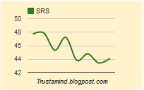
Sector Rank Spread Recovered a Bit but Still In Down Trend
The Sector Rank Spread recovered a little bit last week. But as it failed to make a higher high, the down trend is intact. A positive sign is that the latest downdraft seen the week before last week is of less magnitude than that of previous ones. As this week's move revert to the upside, SRS may start to bottom out. If succeeds, it will add more fuel to this bull market and benefit all investors.

Thursday, June 2, 2011
My Crystal Ball Is Blurry
The Big Money Index made a decisive downdraft today and breached previous significant low seen on May 5th. Technically this confirmed that BMI is now in a down trend. I have been using BMI as a leading indicator for about two years and this is the first time a positive divergence failed. The sharp downdraft indicated that money fled out of the market in a rush and further weakness is expected. But because this time BMI failed to work, I don't want to rush into the bearish conclusion.


So I turned to other charts to gain more clues. The first chart I looked at is TLT. Usually investors flew to Treasury bonds when they tried to avoid risk asset, i.e., the stocks. On the chart TLT formed a technical pattern named "blow-off top". Yesterday it decisively broke to a new high with huge volume, while today it fell back in the same decisive manner and with even higher volume. Usually a blow-off top indicates a key turning point of a trend. It happens when an established trend finally attracted attention of mediocre investors. As they rush in to ride on the trend, the last portion of buying power is exhausted. Smart investors will take the opportunity to offload their positions and the late comers become the unlucky bag holders. They couldn't find anyone else to pay a higher price for their holdings and the price will enter a down trend.


It would be an encouraging signal to stock investors if TLT starts to fall from here. I also took a look at the chart of SPY. On its chart I saw a pattern named "breakout pullback". On May 31st, SPY break out to the upside of a down trend channel. Unfortunately the very next day it fell back into the channel again. This often happens when a down trend has run its course and an up trend is about to establish. Some market participators try to sharply drive down the market to test its determination. In fact a dreadful psychological test happened today when SPY breached its previous low. When a key technical support is breached, weak hands will surrender their positions. A positive sign is that today SPY closed above the support line, meaning it could be only a test. A typical breakout pullback serves to purge out weak hands before the market starts to rally.


If both TLT and SPY point to a bullish outcome, I'd like to disagree with BMI. Nonetheless my most powerful crystal ball is blurry right now, and cautions is highly recommended. But when should an investor be reckless?
Wednesday, June 1, 2011
Big Money Index at Inflection Point
The Big Money Index is on edge. If it drops below the recent significant low seen in May 5th, technically it forms a lower low and invalidates the up trend. It also invalidates the positive divergence we previously observed, and confirms the down trend of the market.


Subscribe to:
Posts (Atom)